
The roster and concern detection
Your patient list, how it is triaged, what Flags means, and every concern tier explained in plain clinical language.
The roster is your home base. It lists every patient in your institution and tells you, at a glance, who needs your attention today. Open a patient from here to reach their full workspace.
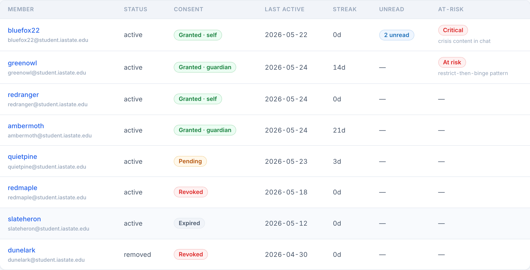
How the list is ordered
You do not sort this list yourself. It arrives in triage order, so the top rows are always the ones worth reading first:
The search box filters by name or email. A patient who deleted their own account shows a greyed Account deleted row for the 30-day retention window; the name stops linking anywhere, because their detail access is gone.
What "at risk" means
The at-risk badge on the roster is a rollup of the same signals you will see, spelled out, inside the patient. The single most important reason shows under the badge so you know why before you even open them. A sustained mood decline is one of these rollup signals now: a patient whose recent mood drifts below their own baseline surfaces as a medium mood trending down reason on the roster, not only on their member page, so you can catch it without opening them. The badge is tiered to match the concern behind it: a red Critical for the acute lane, a red At risk for a high concern, or an amber Watch for a medium one.
The flag says "look here today." It never replaces your clinical judgment, and it is never shown to the patient. Everything behind it is transparent once you open the patient.
Concerns, tier by tier
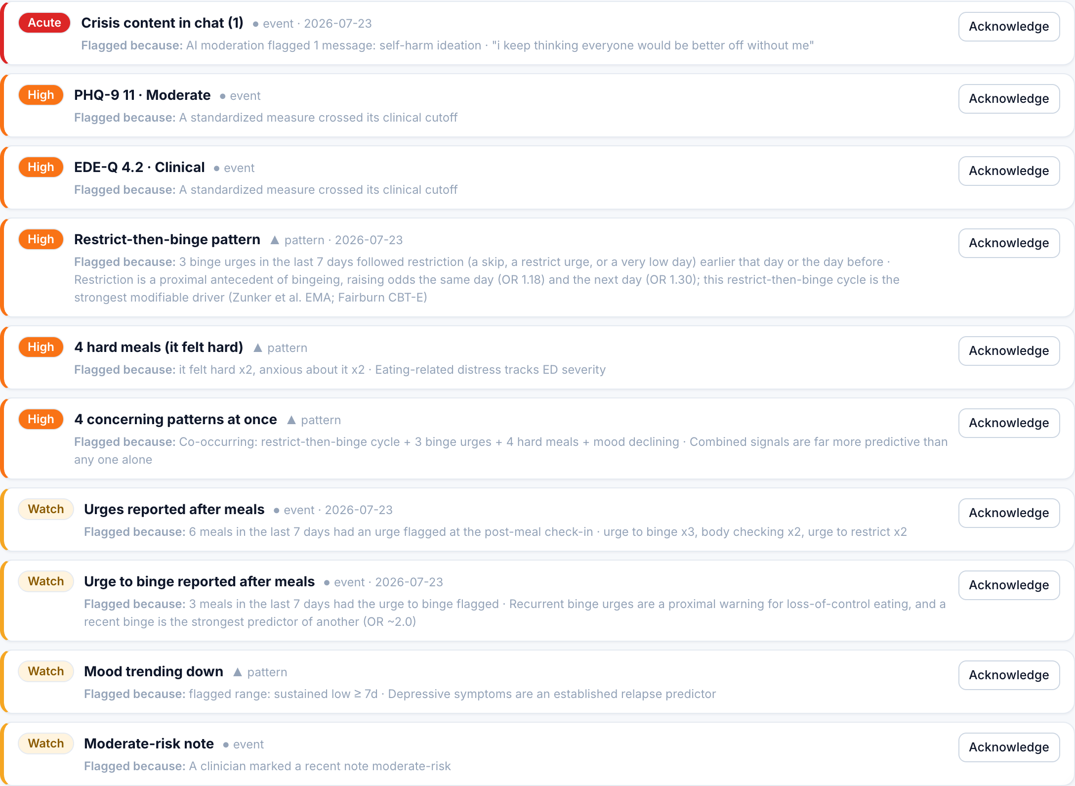
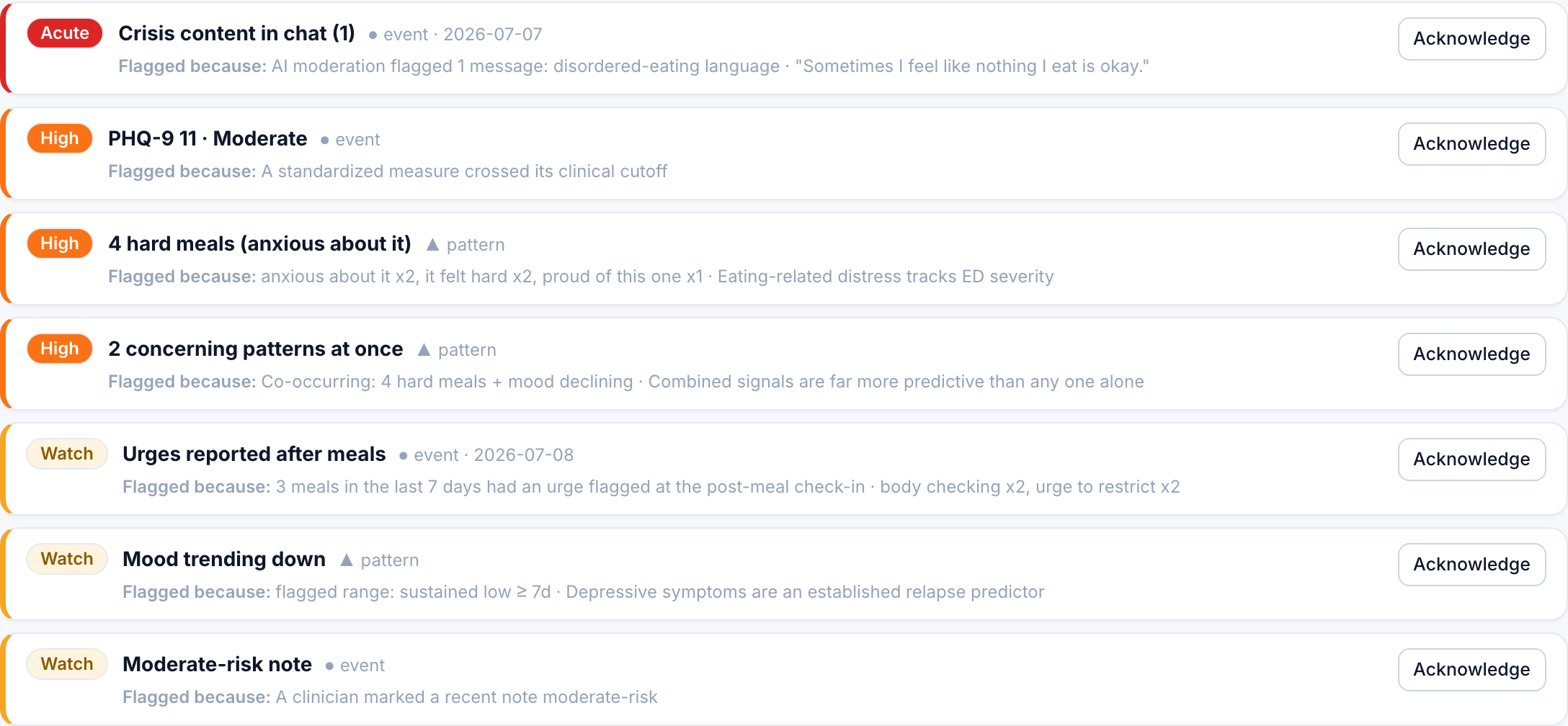
Inside a patient, the concern panel sits at the very top of every tab. Each concern shows a colored severity band, a tier badge (Acute, High, Watch, or Info), whether it is a one-off event or a sustained pattern, and a plain-language "Flagged because" line so you can see the evidence, not just a score. Clicking a concern jumps you to the tab that holds the underlying data.
| Tier | Concern | Fires when | Reads as |
|---|---|---|---|
| Acute | Crisis content in chat | AI moderation flagged one or more messages | Event, same-day eyes |
| Acute | Suicide screen elevated | A recent C-SSRS scored 4 or higher | Event, review today |
| Acute | High-risk clinical note | You marked a recent note high-risk | Event |
| High | Weight down 5%+ | Rapid loss across recent synced weigh-ins | Pattern |
| High | Urge to purge after meals | The urge to purge was flagged at 2+ meals in 7 days | Event |
| High | Restrict-then-binge pattern | A binge urge follows restriction (a skip, a restrict urge, or a very low day) the same or prior day, 3+ times in 7 days | Pattern |
| Watch | Restrict-then-binge pattern | The same restrict-then-binge coupling seen 2 times in 7 days | Pattern |
| High | Possible binge episodes | 3+ meals in 7 days far larger than the patient's own usual, each carrying a binge urge | Pattern |
| Watch | Possible binge episodes | 2 such loss-of-control episodes in 7 days | Pattern |
| High | Urge to binge after meals | The urge to binge was flagged at 5+ meals in 7 days | Event |
| Watch | Urge to binge after meals | The urge to binge was flagged at 3 to 4 meals in 7 days | Event |
| High | Meals not eaten | 60%+ of answered meals marked not eaten | Pattern |
| Watch | Meals not eaten | 40 to 59% of answered meals marked not eaten | Pattern |
| Watch | Urges reported after meals | Any urge flagged at 3+ meals in 7 days | Event |
| Watch | Hard meals | The patient tapped a struggle feeling at one or more meals | Pattern |
| Watch | Mood trending down | Recent mood dips below the patient's own prior baseline | Pattern |
| Watch | Engagement down | Check-ins fell 40%+ versus their own prior rate | Pattern |
| Watch | Moderate-risk note | You marked a recent note moderate-risk | Event |
| High | Very high water intake | 5+ days at or above roughly double their water goal | Pattern |
| Watch | Very high water intake | 3 to 4 such days | Pattern |
| Info | Low water intake | 5+ logged days at or under half their water goal | Pattern |
| Info | Meal gap | The longest stretch without a logged meal in range hit 3+ days | Pattern |
| High | Sessions logged to compensate | Movement tracker: 3+ compensatory sessions, or any alongside a high skip rate, purging, or exercise while sick or sore | Pattern |
| Watch | Sessions logged to compensate | Movement tracker: 1 to 2 compensatory sessions | Pattern |
| Watch | Sessions with driven features | Movement tracker: 2+ sessions the patient marked as had-to, guilt, hidden, or while unwell | Pattern |
| High | "Something else" taken to help | Bowel tracker: 3+ visits, or any alongside purging | Pattern |
| Watch | "Something else" taken to help | Bowel tracker: 1 to 2 visits | Pattern |
| Watch | Mostly hard stools logged | Bowel tracker: half or more of 4+ described visits were Bristol 1 to 2 | Pattern |
| Watch | No period logged in N days | Period tracker: 90+ days since the last logged period, or 90+ days tracking with none | Pattern |
| Watch | Irregular cycles logged | Period tracker: two or more recent cycles longer than 35 days | Pattern |
A few things worth knowing about how these read clinically:
- Weight, skip-rate, and mood are baseline-relative and windowed. A loss or a skip streak from months ago will not keep firing today. Concerns look at recent data; the per-tab charts still show the available history for the selected view.
- High water outranks low water, and the app never mentions either. Drinking to excess is a compensatory behavior, so it is ranked as one; under-drinking is informational. The patient's app stays silent about both, because flagging high intake in-app teaches people to log less rather than drink less. See Water.
- Binge-eating patterns require loss of control, never size alone. The binge concerns key off the self-reported urge to binge (the app's proxy for loss of control), not calorie amounts. A large meal on its own is never flagged, because a big meal can be normal, a celebration, or recovery-appropriate eating. The restrict-then-binge concern reflects the dietary-restraint model (Fairburn CBT-E; restriction raises binge odds the same and next day), and "possible binge episodes" needs both an unusually large amount, relative to that patient's own logs, and the binge urge. This lane is behavioral and non-evaluative by design; it never scores calories or weight.
- Body tracker concerns only exist when that tracker is on. A missing entry is never read as "none", and none of them emails or pushes you. See Body trackers.
- The composite amplifier. When two or more of the pattern signals above are happening at once, Pippa raises one extra High concern: "concerning patterns at once." Co-occurring signals predict relapse far better than any single weak one, so they get combined and lifted.
- Red is reserved. Only the acute lane (crisis chat, positive suicide screen, high-risk note) gets red. This keeps red meaningful and guards against alarm fatigue.
Acknowledging and hiding a concern
Each open concern has an Acknowledge button. Acknowledging records your name and the time, then moves the concern into a quiet "Acknowledged" line at the bottom of the panel. It does not delete anything; it says "I have seen and handled this."
Acknowledgements are keyed to the specific occurrence. If a new crisis message, a new severe measure, or a fresh weight drop into a worse tier comes in later, it raises a new concern rather than staying hidden under an old ack. A pattern drifting within the same tier (say 38% to 39% skips) will not churn your acknowledgement.
Event acknowledgments stay attached to that occurrence. Ongoing pattern acknowledgments are snoozed for 30 days; the pattern can surface again after that window if it persists.
If a concern is not clinically useful for a given patient, hiding it removes the row from your view without recording a formal acknowledgement.
When patient view is on, the roster replaces itself with a "Patient list hidden" card and every concern disappears, so navigating mid-session never exposes another patient or an alert.
Roster actions on mobile
On phones, each patient has a card with labeled membership Status, Streak in days, and Unread fields, plus connection status and concern details. A patient with both a concern and unread messages shows both. Open or Reply remains on the active roster with a touch-sized button. Archive is inside the patient page to avoid accidental clicks while scanning the list.
To archive a patient, open their page, select Customizations, and scroll to Roster membership at the bottom of the page. For a patient awaiting consent, this section appears on Consent waiver instead. Select Archive to move them to the Archived list while retaining records and consent. Restore returns them to your active roster. Archiving is specific to your relationship with the patient; it does not discharge them from every clinician's care.

