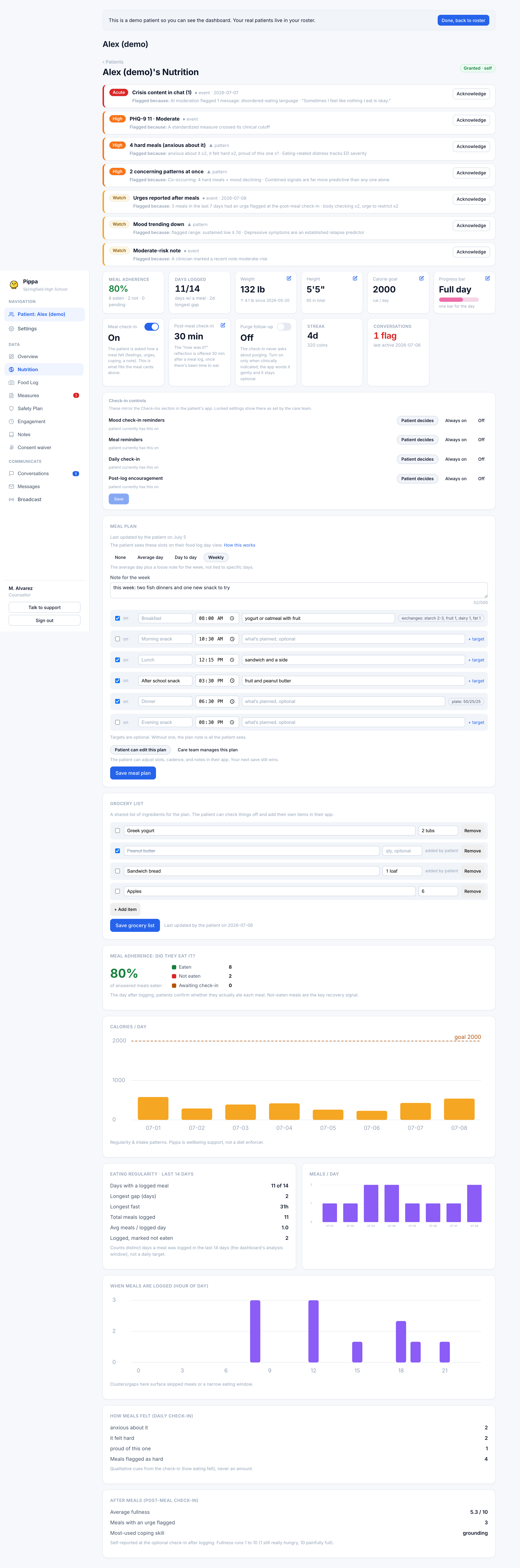
The Nutrition tab
Calories per day, weight trend, eating regularity, and how the weekly synced history reads clinically.
The Nutrition tab is where intake and weight patterns live over time. It leads with the meal plan and grocery list (covered in Meal plans), then a set of charts built from the same windowed data that drives the concern panel. The analysis window is typically the last 30 days; the full history still shows in the charts themselves.
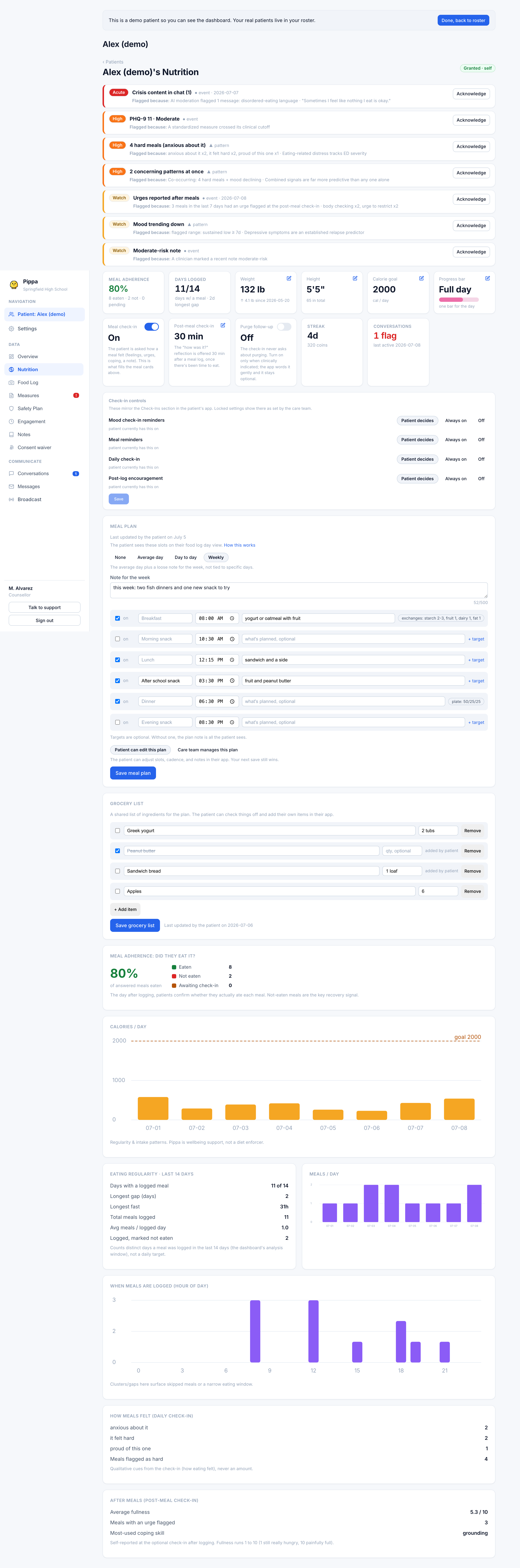
Calories per day
The calories-per-day chart totals each day's logged meals, preferring your corrected calories over the app's estimate wherever you have set one. If a calorie goal is set on Overview, it shows as a goal line. Days that fell under roughly 60% of the goal are drawn in amber so a run of very low days stands out.
This chart is about regularity and intake patterns, not hitting a number. The goal line is context for you, not a bar the patient is graded against.
Meal adherence
The adherence summary shows the percent of answered meals confirmed eaten, broken into Eaten, Not eaten, and Awaiting check-in. A meal counts as eaten once the patient completes its post-meal check-in; skip logs count as not eaten, and untouched check-ins stay pending. Not-eaten meals are the key recovery signal, which is why this summary appears on both Overview and Nutrition.
Eating regularity
This card counts distinct days a meal was logged in the window (for example "18 of 30"), plus the longest gap in days, the longest fast in hours, total meals, average meals per logged day, and how many logged meals were marked not eaten.
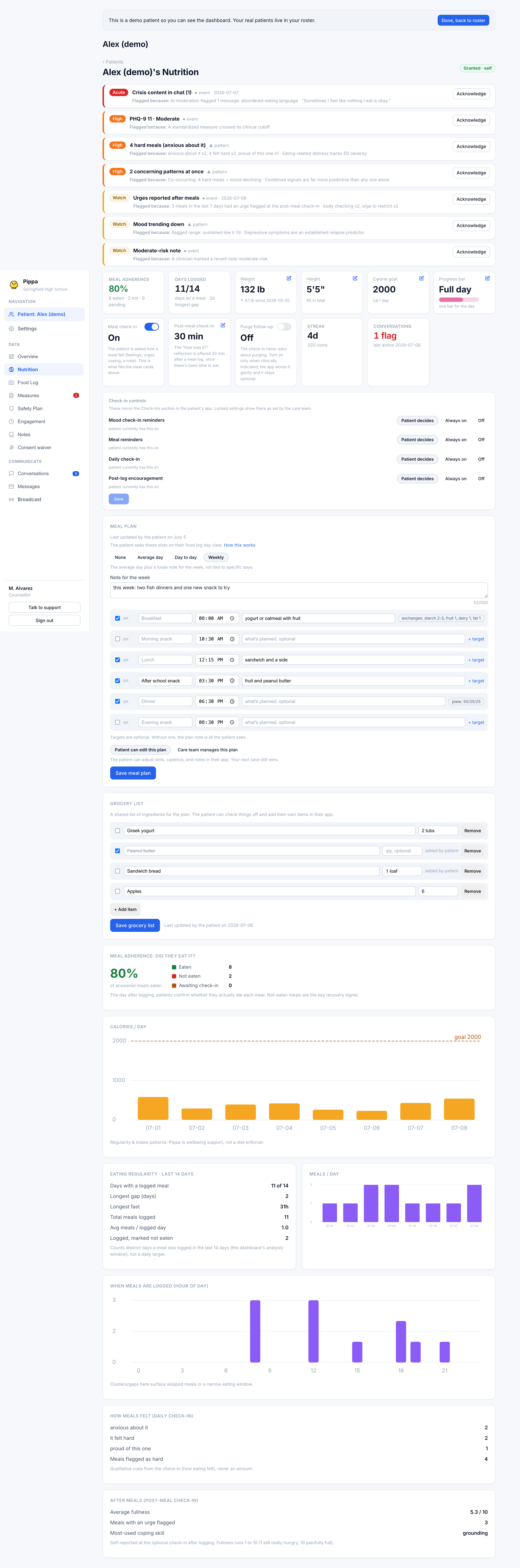
A companion "When meals are logged (hour of day)" chart plots logging by hour, so clusters or gaps surface a skipped meal or a narrowing eating window. A "How meals felt" card aggregates the feeling chips patients tap on meal check-ins and skips, and an "After meals" card rolls up average fullness, how many meals had an urge flagged, and the most-used coping skill.
Weight trend and weekly history
Weight plots weekly. It syncs from the patient's app when they update their profile or log, and you can also record weigh-ins yourself from the Weight tile on Overview.
The weekly history is the backbone of the trend: each synced week carries a weight, that week's own calorie goal, and calories consumed. Because each week keeps its own goal, the Engagement tab can color a week amber when consumption fell under about 85% of that week's goal, rather than judging every week against one fixed target.
When recent weigh-ins show a loss of 5% or more, the trend note calls it out as clinically significant, and the same signal raises a High concern. Rapid loss is a red flag regardless of absolute weight.